
 The other day I received a good old postal package from Berlin, Germany.
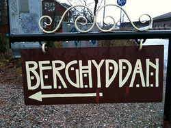
I wasn't expecting any mail, so I wondered what it might contain. To my surprise inside the package I found a beautiful book. At looking the cover it was quite obvious that the book dealt with typography. The book "Karbid. BERLIN — de la lettre peinte au caractère typographique" was written by a team of typographers, namely Verena Gerlach, Fritz Krögel, Sébastien Morlighem and Fred Smeijers. I was delighted, but as the package contained no dispatch note, I kept wondering why I had received the book. Because I knew the sender was FontFont Berlin, I tried to reason that maybe I was such a good customer that they wanted to mail me the book as a free copy. However, that was not the case. Today it dawned to me that I had sent an entry for a contest that FontFont announced. They had asked customers to send a photo of an inspiring typographic example of urban typography, signs or some other cityscape. I had enclosed a photo (the one you see at the top of this blog post). I took the photo some years ago here in Helsinki near Annala (Anneberg) gardens. The author of "Karbid" book Verena Gerlach had used her judgement and selected 15 photos that most inspired her. And mine was among them. That was the reason FontFont had sent the book. But back to the book I received. As much as it is a reading piece it is also a clever advertisement for a new font FF Karbid Pro. Verena tells about the birth of this book: « Towards the middle of the 1980s, Verena Gerlach, a Berlin-born adolescent, regularly crossed the control post on Friedrichstraße to visit a friend living in the east of the city. She started to note and to memorise the inscriptions, shop signs and murals that decorated the facades of buildings and shops, painted in most part between the 1900s and 1940s, and left to decay. After the fall of the wall, Verena, now a student in visual communication at the Kunsthochschule Berlin Weißensee, deepened her exploration of the areas in east Berlin, more specifically Prenzlauer Berg and Mitte. Here she gathered photographs between 1991 and 1998, documenting a large number of shop signs and facades. She returned in 2005, endeavouring to review her initial viewpoints, and could not fail to notice the effects of reunification: this unique epigraphic heritage had almost completely disappeared, covered by the contemporary dealbatores of capitalism.« The featured typeface FF Karbid Pro was originally inspired by these storefront letterings from the 1920s and 1930s. Using it as a starting point, I then disseminate its spirit into a family of well-behaved but energetic text faces. FF Karbid is the result of my final diploma work in 1998. Congratulations Verena! Keep up the good
0 Comments
Leave a Reply. |
AuthorEero Antturi is a Finnish graphic designer with more than 30 years of experience in publishing business. ArchivesCategories |
 RSS Feed
|
© Copyright 2014 by Antturi Design Oy, Finland. All photographs and design samples copyright of their respective owners. All rights reserved. All unauthorized use prohibited.
This website template by Weebly.com |